WristWorthy
WristWorthy is an E-Commerce platform designed around selling enthusiast centered wristwatches to watch enthusiasts at affordable prices.
About
WristWorthy is a successful online retailer of watches, but have encountered several obstacles towards their profitability. They wish to enhance their browsing and checkout experience in order to improve their product’s usability.
Timeframe
The creation of this app took 2 months

The Problem
WristWorthy is a successful online retailer of watches, but have encountered several obstacles towards their profitability. They wish to enhance their browsing and checkout experience in order to improve their product’s usability.
The Product Manager of the retailer has done research into the matter and has come up with 2 main points of contention with the website.
50% of users open on average 7 item pages and then abandon the site without moving any items into the cart. Their hypothesis is that users are unable to determine which watch is best based on relative features.
70% of users who place an item in the cart do not purchase. Data shows users abandon the cart at the registration page. Users currently have to make an account to purchase. The PM wanted me to design a guest checkout in order to solve this, and it must capture the customer’s email.
The Solution
I ran 2 weeks of design sprints based on the design thinking methodology, which includes 5 stages: empathize, define, ideate, prototype and test. I eventually created a Watch Features Comparison tool that allows for users to select multiple watches that they wish to compare with each other to determine which one is best, along with a Guest Checkout feature.
My Role
I was brought onto the project in order to find a way for users on the website to have some method of comparing multiple types of watches in order to be better informed as to what watch to purchase, and thus increasing the amount of customers finalizing their purchases. I was also brought on to design a guest checkout experience as well that would capture the guest’s email.
Design Process and Journey
The first step I did was to conduct research on competitors in the watch ecommerce space across multiple spectrums of affordability. My theory with this was to see what our competitors were already doing in the watch space, in order to see if they already had a solution to this problem, or if there was a gap in the market for a feature that didn’t exist already, along with other important competitive analysis.
The watch ecommerce websites I chose for this study were Jomashop, AliExpress, and Teddy Baldassarre.
Jomashop
AliExpress
Teddy Baldassarre
Across all websites I found that these ecommerce websites rely heavily on their product pages to explain the product to the user. They had highly detailed product pages detailing all the features of their watches, along with consistent photography. They also contained “Recently Viewed” and “You may also like” functions to suggest similar watches to their users.
I also did research into each website’s guest checkout experience, and noted their best features and functions. They all contained the ability to perform a guest checkout simply by typing in your email address and checking out with it.
Consistent Photography
List of features and specifications
Mindset of comparison
Guest Checkout with email capturing function
However, all of these features were very passive in solving the problem laid out to me by the PM. None of the competition had a direct method of guiding users to directly compare different types of watches with one another, making the decision to purchase a watch firmly based on recommendations by the website.
Because of this, I directed my research into a different category of products that I knew was also heavily feature focused: tools. I did research into different hardware websites, such as Ace Hardware and Home Depot, and found that they had “Comparison Tools” that allowed for the user to select multiple similar products on their website and then directly compare their features with one another .
Ability to select multiple products
Direct comparison between them
Page that shows how to compare each function
Mindset of comparison
Competitor Research
Design
User Flow
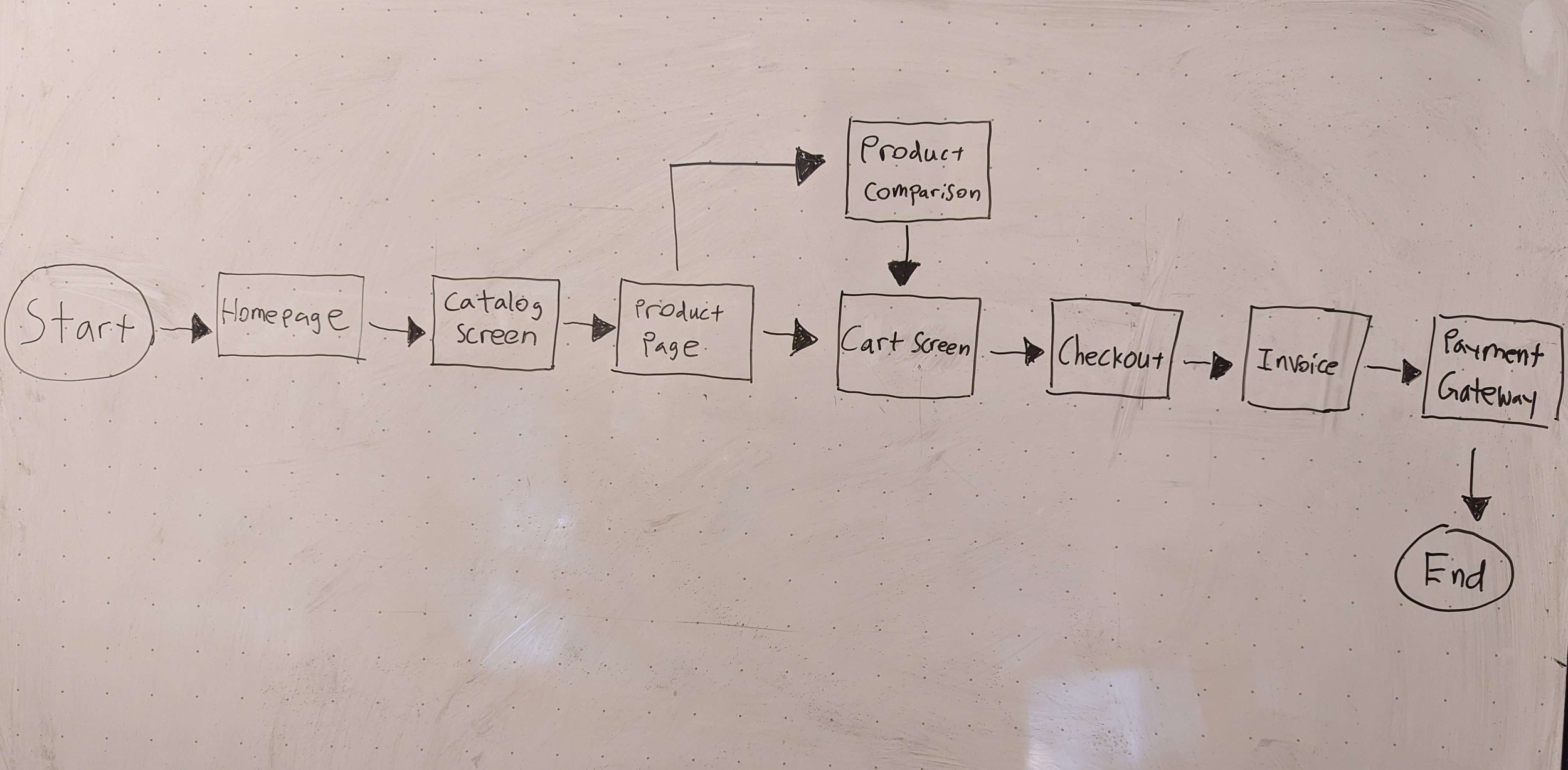
Based on my research, I started off my design with a simple userflow that illustrates my thinking process. I want the user to start off on the main page of the ecommerce website, before self directing to the types of watches that they want to purchase. During this process, they will be lead to a Product Comparison tool that should be self explanatory, and the user will use this tool in order to select several watches in order to compare them.
After this process is finished, they will move to the checkout process, where they will be exposed to the guest checkout experience that captures their email address, before finalizing their checkout and paying for their product.
Low Fidelity Prototype
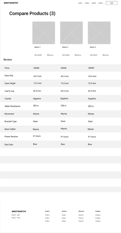
After completing my user flow, I moved on to constructing a low fidelity prototype, using existing wireframes provided to me by WristWorthy. In this stage, my goal was to capture the basic user experience with the watch comparison tool, and the guest checkout experience.
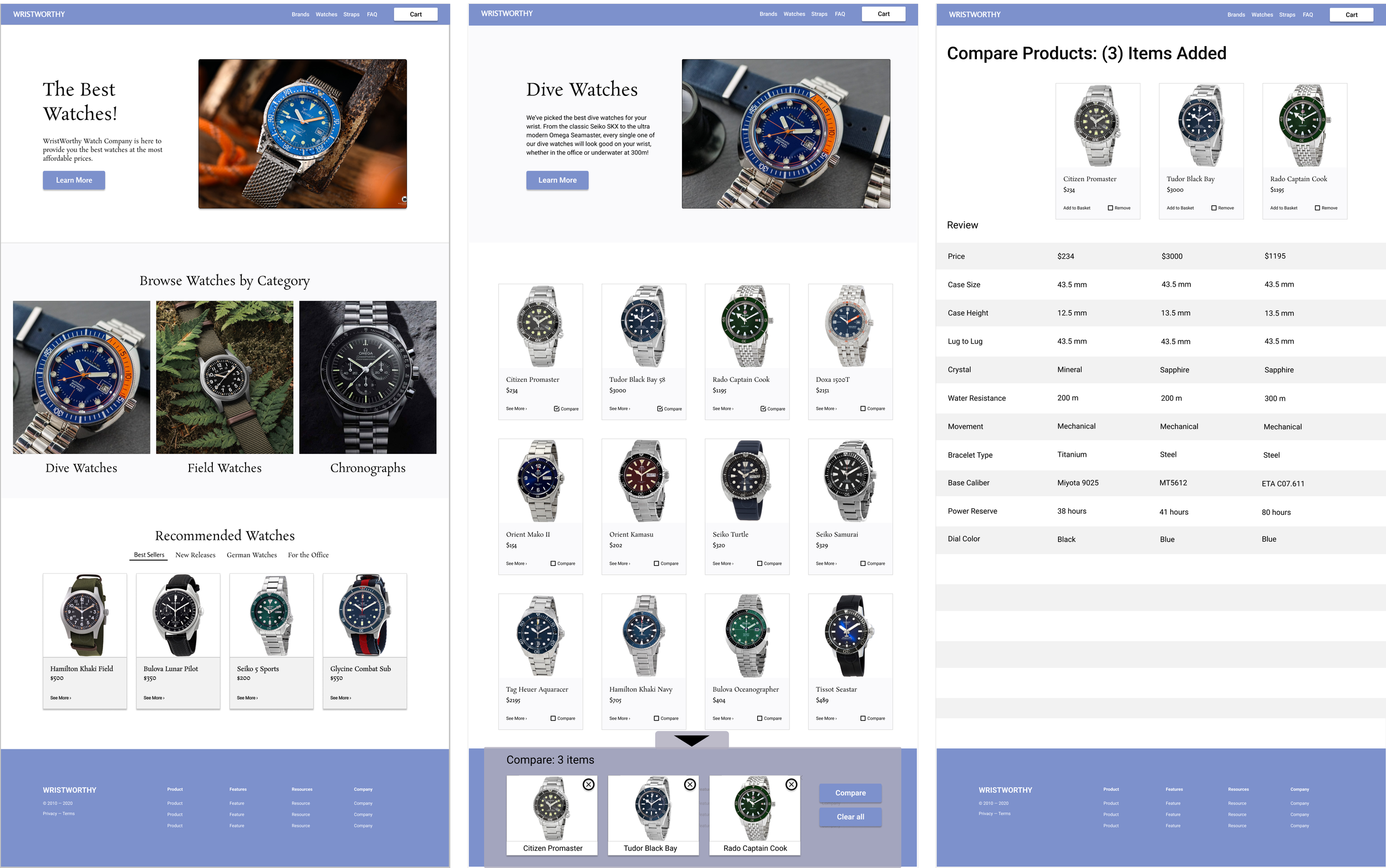
The first thing I had to do was create an interface that enticed users into a mindset of comparison. In order to do this, I created a simple, straightforward card based product page that listed all of the types of watches by category, along with each watch type. I placed “Compare” checkboxes in every card in order to subtly inform the customer that a comparison feature existed on the page.
When a user clicks on the “Compare” button, a pop up appears at the bottom of the page that shows what watches the user has selected so far. This feature scrolls with the rest of the website as the user goes through it. I call this the “Watch Comparison Tool”.
After the user has completed selecting up to 3 watches, they simply click on the “Compare” function and it brings them to the product comparison page, where they are then allowed to view all of the watches they selected along with all the most important product features that are important to watch enthusiasts. This allows for users to have a comprehensive look at what details they are most interested in when doing research on their favorite watches, which hopefully will entice them to finalize a purchase over simply abandoning the website to look elsewhere.
For the guest checkout experience, I created this mock up where upon entering the checkout process for the first time, users are enticed to enter their email in a plainly marked box. This should capture their email address for the company, along with allowing for them to checkout without creating an account.
Interviews
After creating my prototypes, I had to conduct interviews with multiple people in order to find out what they thought about my design. I selected 5 people that shared an interest in wristwatches and had purchased items online before to partake in this interview to get their thoughts on the process, and if it helped them with making a decision towards purchasing a watch on WristWorthy.
My questions were focused around the user hypothetically wanting to select 3 dive watches to compare, then using the guest checkout feature to purchase a watch.
These are the questions I focused on during the interviews:
How do people navigate to a watch category?
Is it easy for users to find the watches they want to compare?
Is it easy for users to add the watches they want to compare to the comparison tool?
Is the comparison tool useful for comparing different watches?
Does the guest checkout feature make sense and work properly?
Interview Findings
After conducting tests on users, I found several issues that the users thought hindered their capability. This is what they had to say:
“I see an email address but there’s nothing that says that it’s the guest check out. I’m confused as to what this means.”
“What if I made an error and accidentally shipped it to the wrong address? What would I do? Is there information or anything that would tell me what to do? Any information on how to fix things?”
“Can I create an account at the end of everything?”
“I feel like I have to select 3 things to compare because the wording makes it look like I have to choose 3 things. Can I choose less than 3 things? What if I just want to compare two things?”
High Fidelity Prototype
Finally, after conducting all these interviews and condensing it together, I created a high fidelity design using all my gathered information, and made changes to the final design based on user feedback.
Homepage Experience
For the main homepage I went with blue as a highlighting color for the toolbars and the menu buttons to highlight important things for users to click on. I also changed the “Browse watches by category” to more interesting images instead of just product cards in order to prevent users from being confused on what purpose they served.
Product Comparison Tool
For the product section, as per my competitor research, I added in watch images that were consistent in look and feel, in order to make the page look professional and give users the ability to compare watches at a glance just on the product page itself. This is important because it allows users to already mentally adjust to the state of the watches as they are, and make decisions right off the bat without having to go to other websites to get better angle images of the watches themselves. I also added transparency to the watch comparison tool in order to make it look nicer.
Finally, on the watch comparison tool, I made sure everything lined up properly and added in proper watch specs based on real life watches to give it a feel of professionalism in regards to a real life test scenario. It makes it easier for enthusiasts to look at exactly what features they want to look at along with the consistent images.
Guest Checkout
For the guest checkout experience, based on user feedback, I added clear labels that the email box is actually the guest checkout feature, so users aren’t confused as to what it means to enter your email address in a random box.
Also, throughout the checkout experience, I made sure to add a new back button in case users needed to make changes to their purchase orders.
Wrap Up
Outcomes
Prioritizing competitor research helped me quickly understand user behavior and improvements needed for WristWorthy. It also helped me to create an application that addressed the needs and issues presented to me by the PM of WristWorthy.
Challenges
Since this was my third project as a UI/UX designer, handling such a detailed project was a challenge in and out of itself! I believe I handled it well, and learned a lot I can use to carry on to future projects.
Sticking to a self imposed time frame and schedule was difficult, but part of the learning process was learning to be flexible and modify the timeframe on the fly whenever roadblocks came up.
There were times where I lost my motivation and felt like I had taken up a challenge I could not handle, but taking breaks to breathe and recollect my thoughts helped to rejuvenate me and let me power through.
What I learned
What I learned from this entire process was how to ideate, research, and come up with a working prototype based on an already existing company based on their wants and needs. Starting from this angle to create an entire product was a hugely educational experience that taught me how the entire UI/UX process works. In the future, I know better how to do market research and how to ideate better by using more carefully curated test users, and how to make better prototypes in Figma.


